LOGO DESIGNArche Shop
I met Jay, owner of Arche Shop, when our bands started playing shows together in the early 2020’s. Jay is a very talented person and an obvious craftsman, so I was very flattered when he reached out to me for a shop logo.
Like many logos, Arche Shop’s logo was born out of a “really bad drawing” that Jay had kicking around. I spent an afternoon flipping through the entire archive of Pacific Woodworker, brushed up on the moons of Jupiter, and got started.
EXPLORATION
•
EXPLORATION •
I took the sketch that Jay handed me and reworked it by hand for a while, trying to introduce new forms and more interesting, meaningful shapes and interactions (pictured right).
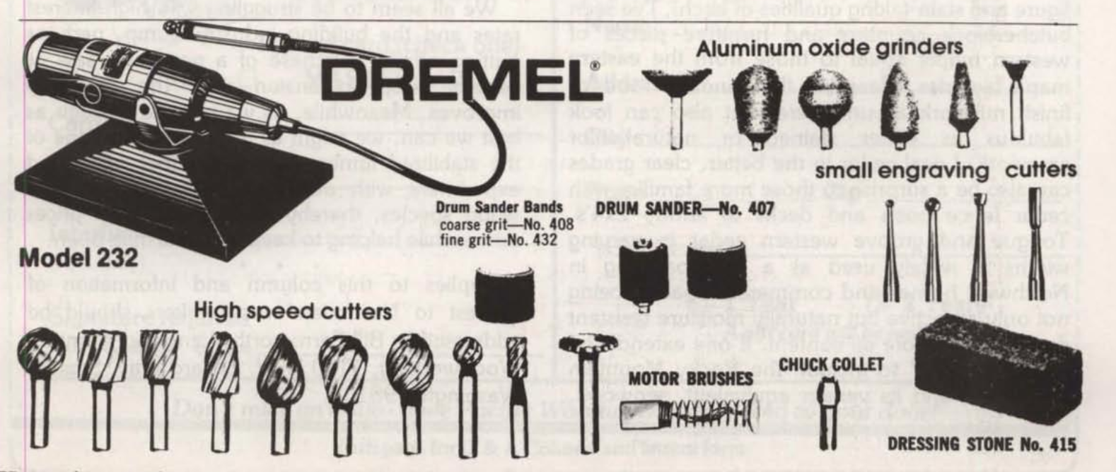
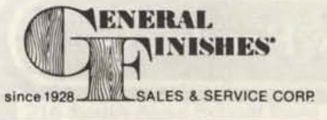
I turned to Pacific Woodworker magazine, a trade publication that published its first issue in May 1981, to get my eyes on some relevant legacy type for this space (pictured below).
I didn’t want to play vintage dress-up for the Arche Shop logo, but seeing the tangible roots of things is always helpful for dropping me into the context of something I’m not familiar with (like woodworking).
Magazine design from the pre-digital era inspires a less-is-more attitude and roots me firmly in the belief that a logo really can say more with less.


Logomark first.
I started opening up some options to Jay by showing him the far corners of what I had in mind for the logomark, sans type.
The four iterations (pictured right) contrast heavily against each other, each offering something different (noted below each sketch) while still featuring the mark’s non-negotiables (arch shape, bowl cut-out).
I would have been happy moving forward with any of these options. When this is the case, I cross my fingers for a strong client reaction. Jay is mercifully decisive, and we moved forward with the “FOUR MUSES” concept, which is rooted in the namesake of his business.
Better balance.
Logotype only.
Jay gave me free rein with the typography, mentioning that he’d seen my work and was a fan of the type choices he’d seen on other stuff I had done. Cool!
Before we started work on this, we decided “no wood textures, no images of saws, no cutesy hinting at wood in any way.” So I selected a handful of fonts that present strongly as balanced, sturdy, and heavy. The “big wooden tables” of fonts.


