ART DIRECTION + BRAND DESIGNCITY Magazine’s Best of Rochester
Always kind of the same, always pretty different.
CITY’s Best of Rochester Readers’ Poll is an annual tradition and a holdover from our days as an alternative newsweekly. Every year, we ask our readers & followers to nominate who they think is the best of the best in over 150 different categories spanning from Best Place To Take a First Date to Best Cheap Eats to Best Tattoo Artist, and so on.
It raises the question, every year, “Can our team of 5 pull this off without blowing our budget and killing each other?” The answer has always been yes, and each year, we are fortunate to be able to take Best of Rochester to new heights.
Best Of requires its own one-off brand and breaks every template we have. I always look forward to the unique challenge of dreaming up some new way to style this beloved (and sometimes contentious) annual issue of CITY.
•
2024
• 2024
Best of Rochester ‘24
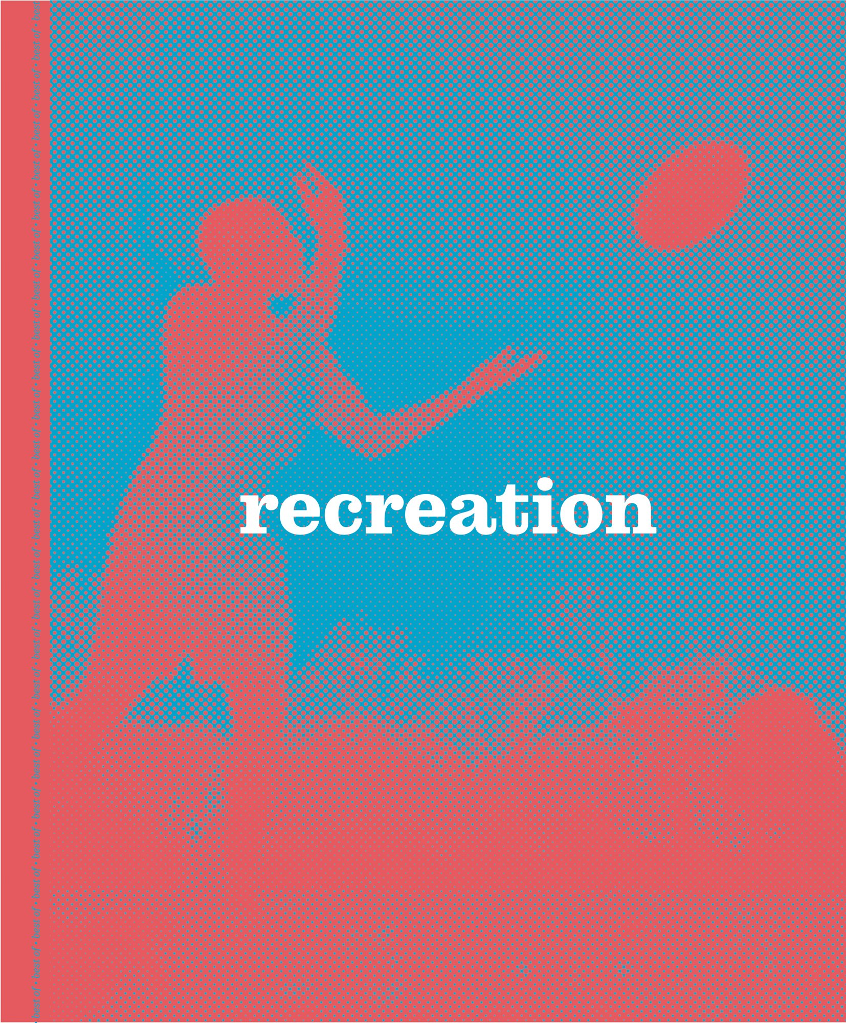
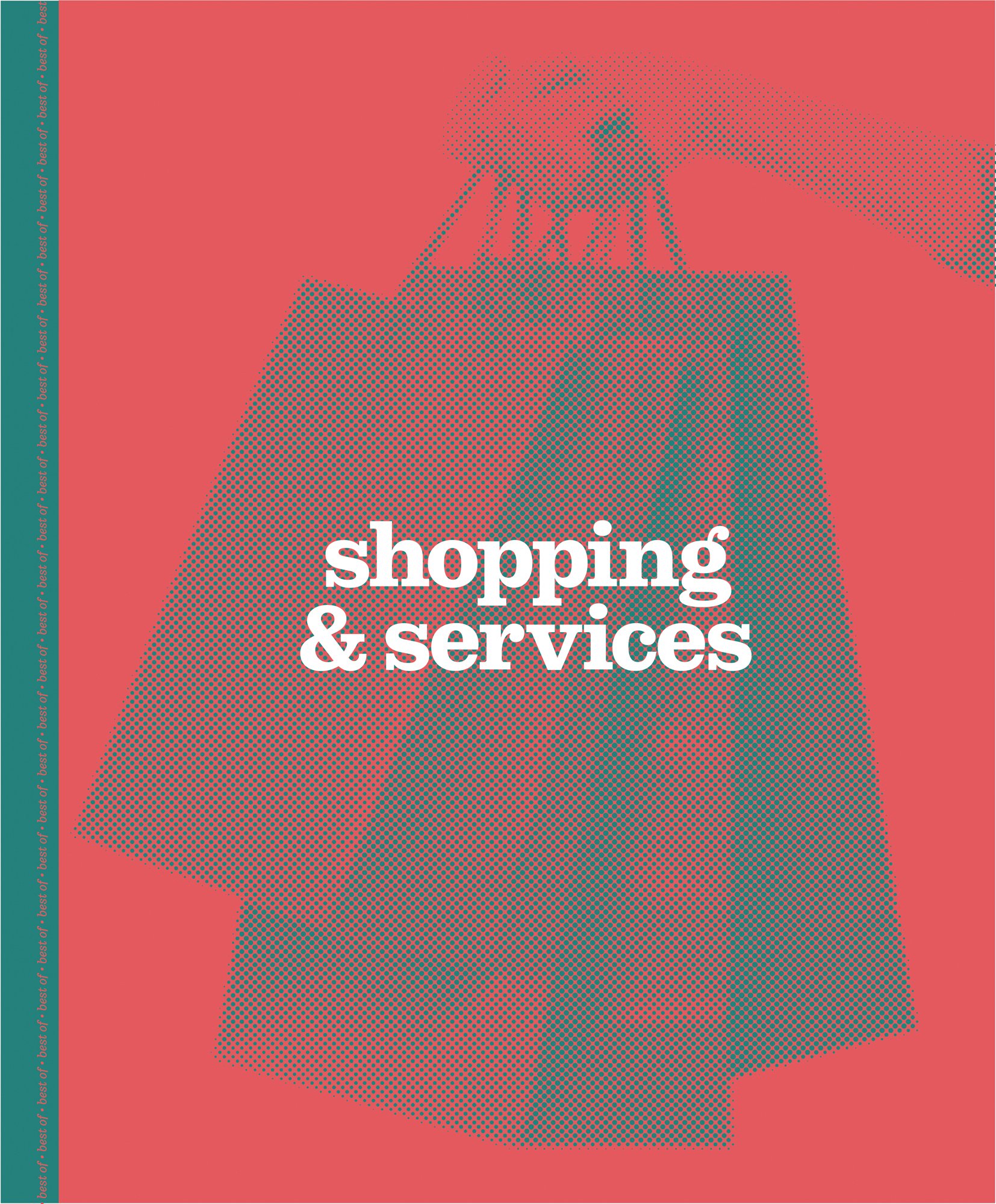
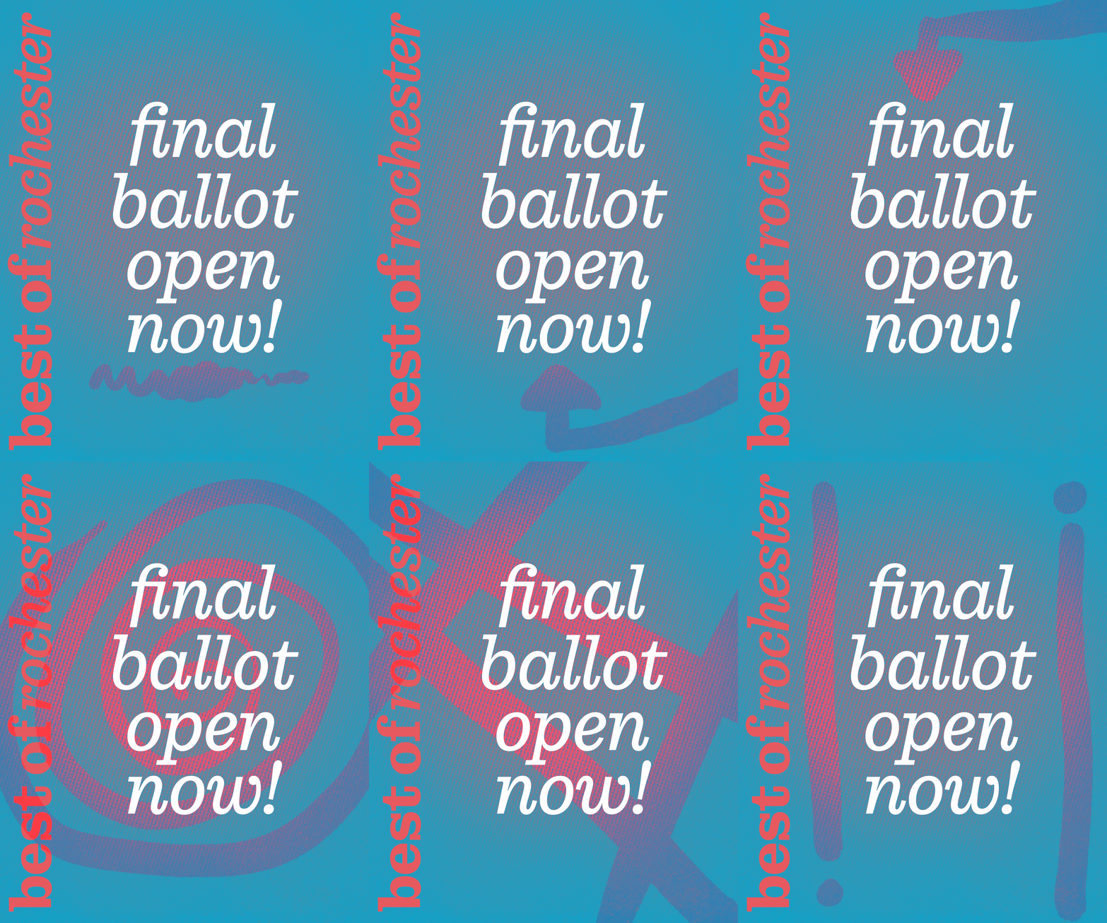
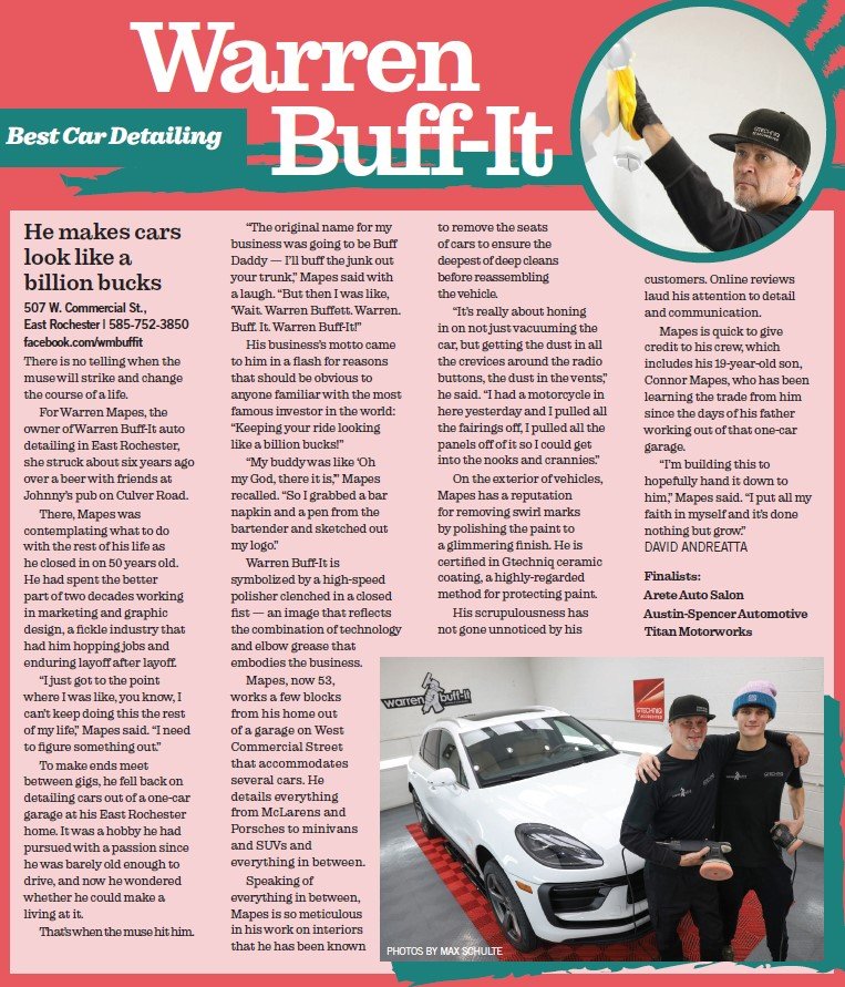
In 2024, I was experimenting a lot with mixed fonts and finding my way with that trend without overdoing it. I would most commonly see ornate, flowy script fonts paired with condensed serifs or hefty sans fonts, and I wanted to try something different.This particular year’s Best of Rochester brand is another exercise in off-the-leash maximalism with a limited palette and lots of clashing textures; my favorite.
These books always necessitate lots of improv leading up to the deadline, as it’s a blurb-heavy edition written largely by freelancers. To prepare for that design challenge, I set up my assets - from the trophies and the textured brick stacks to the Super Mario hills and the checkerboard floors - to later be rearranged and puzzled together to fit around the content when necessary.
Give the two colors some cheeky nicknames so it’s real (Diminished Diva Pink and Theoretical Matte Black) and off to the races you go.


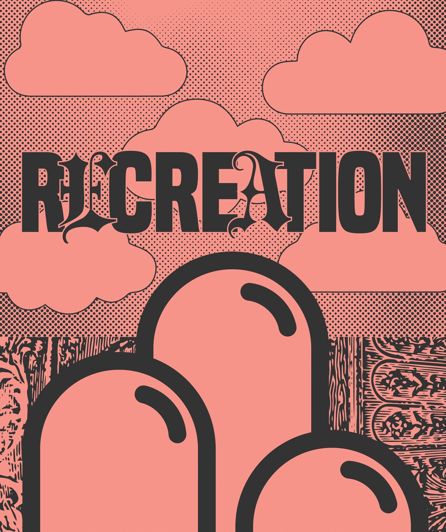


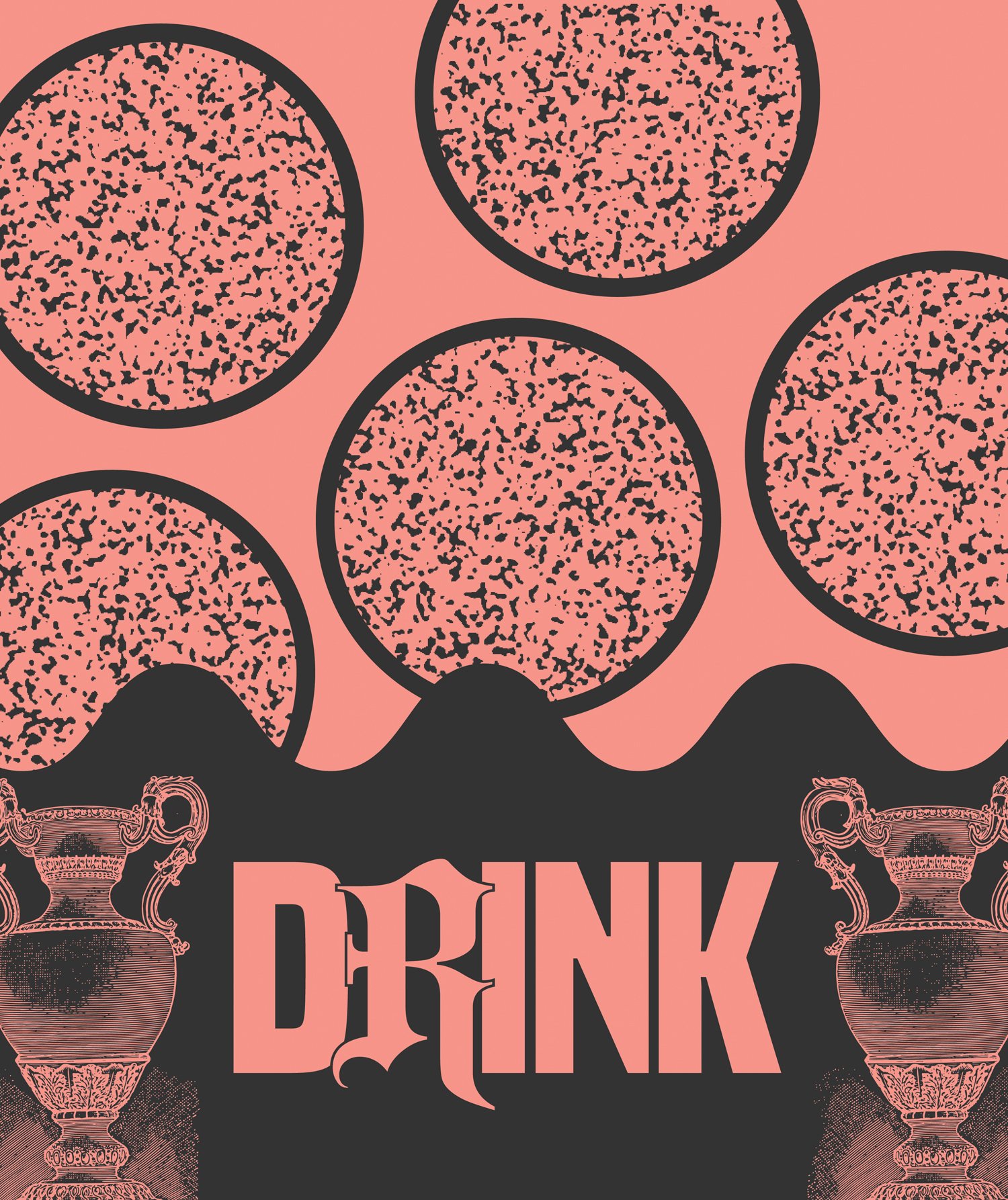


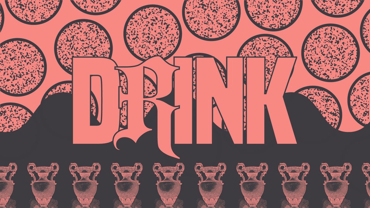


I announced the winners and emceed the Best of Rochester ‘24 Awards Show & magazine release party to an audience of roughly 500 artists, entrepreneurs, cooks, musicians, yoga instructors, bartenders, bouncers, drag queens, tattoo artists, strangers, friends, and colleagues. A thrill & an honor.
•
2023
• 2023
Best of Rochester ‘23
This was the year we pushed Best Of to be more of a community event; more folks showing up to the party, more people making visible contributions to The Thing, and a new editor who was more interested in making a splash locally than the previous one. To this end, I wanted a chaotic, crowded feeling to the brand. I found a set of vector cartoon faces on our stock site and set to making them all befriend one another. Big party, bright colors, emphasis on fun. Love all these dudes.Side-note: The set designers on The Holdovers (2023) used that same set of vector cartoon faces when designing a Christmas Tree roadside stand. I’d recognize these guys anywhere. I like to think we’re linked in that way.




2022
•
2022 •
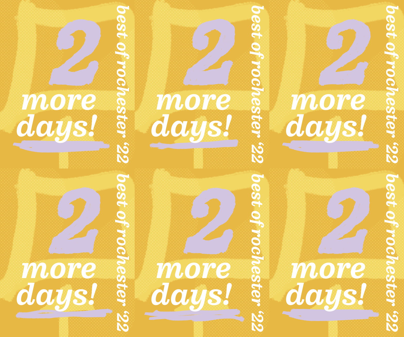
Best of Rochester ‘22
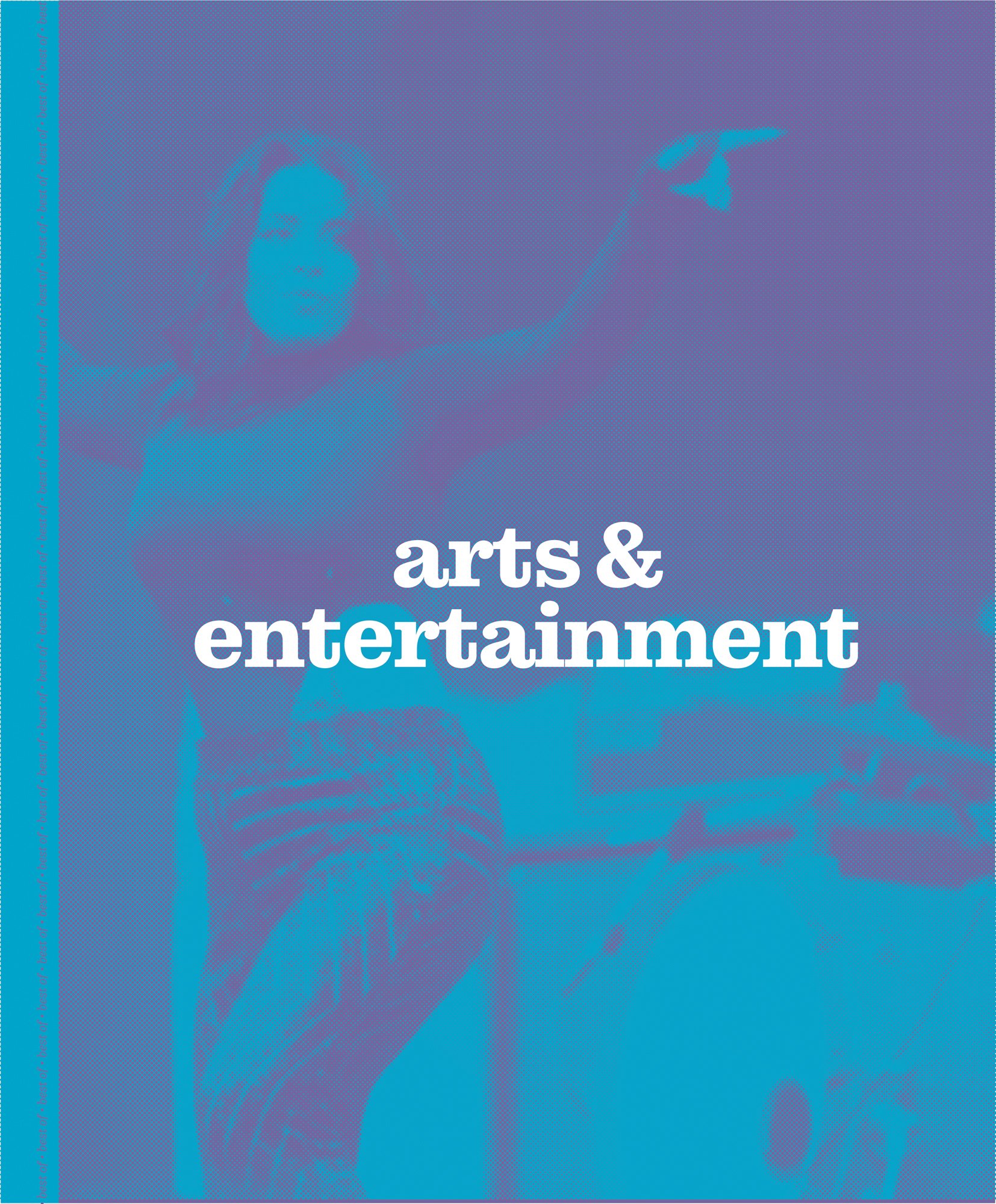
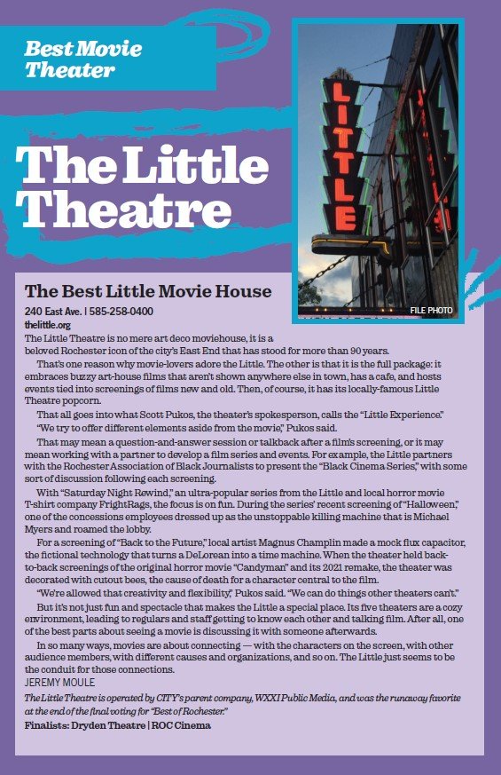
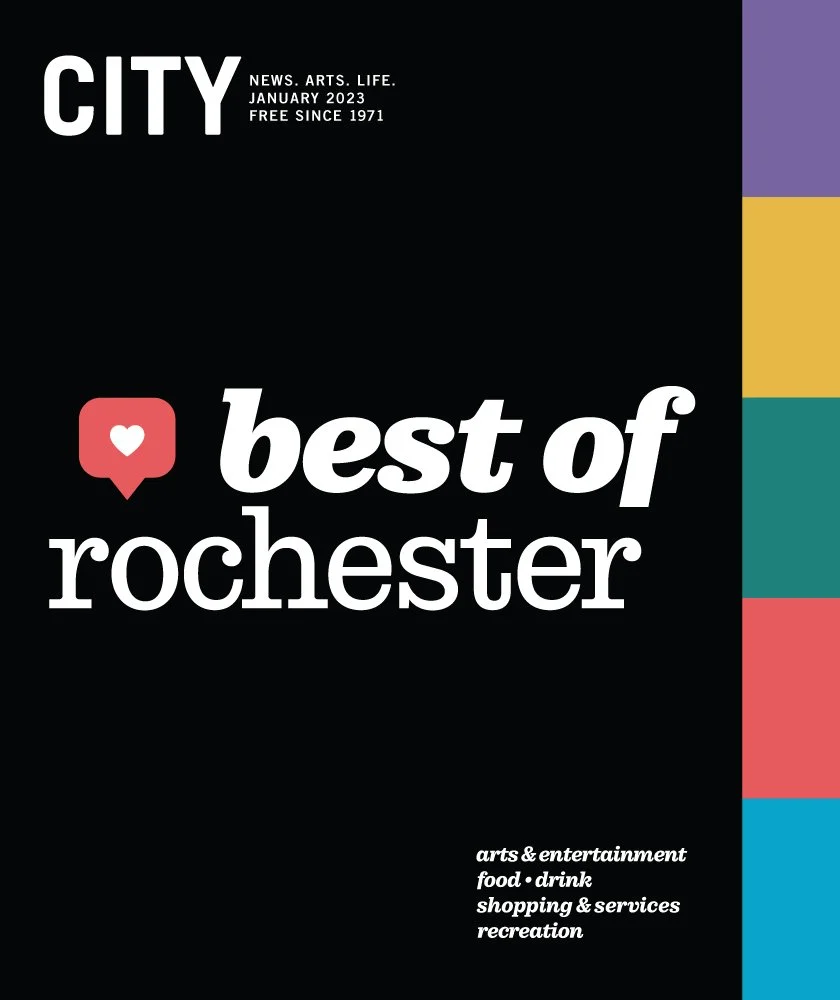
Inspired by old L.L. Bean and Patagonia full-page glossy print ads. Five primary colors, all inspired by jackets and sneakers from the 90s. Go figure. To this day, I am soothed by the gentle quality of these shades, and how bold they were able to be against black, and with big typography. My first time directing the whole brand & book on my own. Near and dear to my heart.

